AQI and You: A Guide for Understanding the Air Quality Index
AQI and You: A Guide for Understanding the Air Quality Index
Air is our most intimate commons, yet it can also feel like the hardest thing to personally know. Paradoxically, air quality has become more visible due to an explosion of monitoring and visualization tools, but visibility isn’t the same as understanding. Data literacy, despite its prominence, rarely extends to environmental data. Air quality dashboards appear everywhere, yet the story of the air around us often remains opaque.
Over the last decade, low-cost monitoring has expanded beyond government agencies and researchers. Now, measuring and collecting air quality data is no longer their sole purview, but also that of citizen scientists and consumers. Affordable sensors, in-car devices, purifiers, and air quality monitors produce more data than ever, but more data hasn’t meant more clarity. For example, the AQI was designed to simplify complex science into a single number. But simplification comes at a cost—it can flatten the complexity of exposure and daily life.
As a designer of air quality monitors, I’ve seen this tension firsthand in my work, leading households in the process of pinpointing and limiting the pollution sources in their homes. An important part of this process is creating opportunities for people to make meaning from the pollutant data that comes at them. Air data is notoriously difficult to parse, and consumer devices often compound the problem by filtering results through proprietary algorithms and arcane indices. The result? What should be a shared commons of knowledge ends up fragmented, incoherent, and inaccessible.
That doesn’t mean we shouldn’t try to understand. Air pollution affects people differently, which means we need different ways of measuring and engaging air quality based on our personal needs. Pollution from thick, particulate-laden wildfire smoke calls for one kind of response, but the subtle impacts of chronic ground-level ozone require another. However, one principle remains across contexts: The act of understanding the meanings behind the numbers is what matters. As government resources thin and institutional responses lag, developing personal habits based on your air quality needs is important to living a healthier life.
This guide is about that gap between what numbers say and what they mean, and how combining official indices, consumer devices, and everyday practices can shape each of our narratives about the air we breathe.
AQI in Plain English
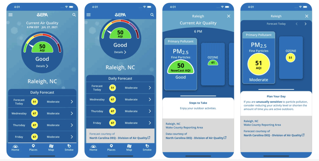
Measuring for yourself is crucial. But the most common way people encounter air quality data isn’t through a personal monitor but through a single number: the Air Quality Index (AQI).
The US AQI was created as a government tool to simplify complex pollution data:[1]Seth A. Horn and Purnendu K. Dasgupta, “The Air Quality Index (AQI) in Historical and Analytical Perspective a Tutorial Review,” Talanta 267 (2024): 125260, … Continue reading one color-coded number that tells the public whether today’s air is safe. Over time, it has become the dominant frame for air pollution monitoring and communication, appearing everywhere from weather apps to smartwatches.
Importantly, most AQI numbers you see on consumer gadgets aren’t really AQI at all. The EPA’s official index tabulates information on multiple pollutants—carbon monoxide (CO), sulfur dioxide (SO₂), nitrogen dioxide (NO₂), ozone (O₃), and particulate matter (PM₂.₅ and PM₁₀)—and applies strict rules about averaging. By contrast, most devices often only use a single PM₂.₅ sensor, run the data through a proprietary formula, and map it onto the familiar 0–500 scale.
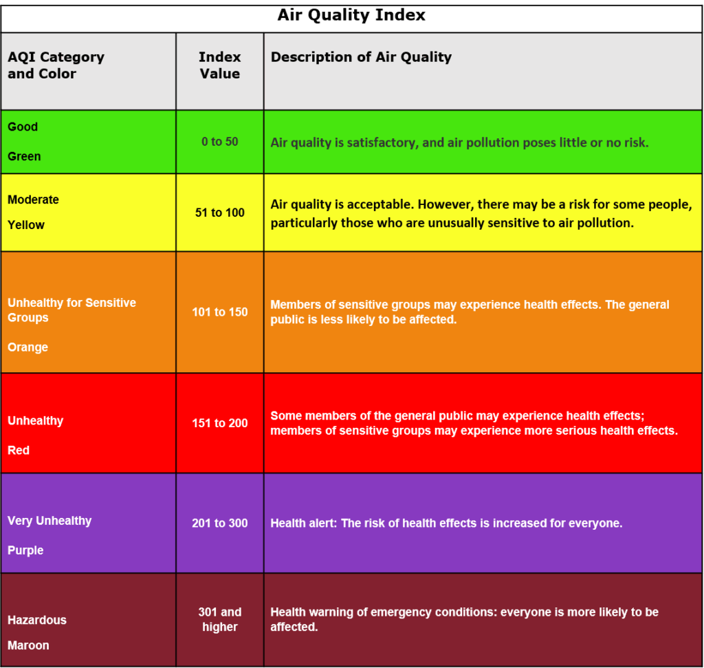
Particulate matter 2.5 (PM₂.₅) are particles smaller than 2.5 microns in diameter, small enough to slip past the body’s natural defenses and embed deep in the respiratory and cardiovascular systems. They come from combustion sources like cooking oils, smoke, candles, vehicle exhaust, and wildfire smoke. Whatever the source, any single reading is just a snapshot. Depending on the tools available to you, look for the raw number in micrograms per cubic meter (µg/m³), as raw concentrations tell a fuller story of what’s happening. Indices like the AQI compress raw data into broad categories for easier communication, but in doing so they smooth over details, such as differences between moderate and high pollution episodes. Raw concentrations (µg/m³) preserve important granularity, allowing for clearer comparisons over time and against health-based standards.
AQI, whether issued by the EPA or a consumer product, is not perfect. Yet, oftentimes, it’s the only tool many people have for making decisions regarding their air quality. And while these indices are not standardized, there are ways of using the data gathered and generated to develop proactive responses to bad air moments.
Index to Lived Experience (Designing Your Own Index)
This is the official formula the EPA uses to convert raw pollutant concentrations into a singular AQI number:
AQI = [(Ih – Il) / (BPh – BPl)] * (Cp – BPl) + Il
But you don’t need complex math to create your own frame of reference.
Air quality is never just about models or math. It’s about lived experience. The real baselines aren’t abstract numbers; they’re the patterns in your day that tell the narrative of your air. When framed that way, air data stops being a technical artifact and becomes a tool for finding ground truth in daily life.
Sometimes people make this leap in surprising ways. One household I worked with discovered their “index” when they set up an air quality monitor I designed for them. The husband leaned in, farted, and the device spiked to 25 micrograms per cubic meter of PM₂.₅. From then on, that fart became their personal reference point: Cooking dinner was “about two farts,” incense “one and a half.” This personal air quality index made the numbers stick. Suddenly, the data wasn’t abstract; it had a reference point they could picture, laugh about, and remember.
Grounding air data by logging symptoms, noticing when a purifier finally clears the air, or attaching numbers to lived contexts makes them real. It allows you to adjust your behavior in ways that charts and color codes alone don’t inspire.
Understanding Trade-Offs
There’s no such thing as “pure air” indoors. Every attempt to clean it comes with a trade-off. For example, air purifiers effectively lower particle levels, but they often encourage people to seal their homes tightly.[2]Jindong Wu et al., “The Synergistic Effect of PM2.5 and CO2 Concentrations on Occupant Satisfaction and Work Productivity in a Meeting Room,” International Journal of Environmental Research and … Continue reading The result is impressively low PM₂.₅ numbers, but elevated CO₂ levels. Less particle pollution, but staler, heavier air. I’ve seen this play out in real households, like one in Salt Lake City where the air purifier worked flawlessly, yet CO₂ levels climbed past what’s considered healthy.
The challenge is balance, and that starts with knowing your risk profile. For someone with asthma, ozone may be the bigger threat than particles. For someone living in a city with relatively clean outdoor air, cracking a window may be better than running a filter. For those living in regions with wildfire smoke or chronic smog, a purifier might be essential, but it should be paired with awareness of what else gets trapped along with the particles.
The question isn’t whether to purify or ventilate, but when and how. A few simple rules of thumb can help.

Best Practices
- Ventilation vs. filtration. If outdoor air is generally clean, opening windows will usually refresh your space and lower CO₂. During wildfire season or heavy traffic days, close up and run a HEPA (High Efficiency Particle Arresting) purifier instead. Switch tactics based on conditions, don’t lock into one strategy forever.
- Watch the numbers in pairs. If your device shows multiple pollutants like PM₂.₅ and CO₂, treat them together. Low PM with high CO₂ means it’s time for fresh air. Low CO₂ with high PM means it’s time for filtration. If your device only shows “AQI,” dig deeper for the raw µg/m³ or ppm values, if available.
- Time your responses. Pollution isn’t constant. PM₂.₅ spikes when you cook. CO₂ builds up in enclosed rooms. Ozone peaks on hot afternoons. Run the purifier when spikes occur, ventilate when outside air is better. Short, targeted actions often matter more than keeping machines on all day.
- Track your symptoms. Keep a simple log of headaches, fatigue, coughing. Over time, you’ll see which pollutants affect you most, and which interventions make a difference. That log can become a personal playbook more useful than any one-size-fits-all index.
The goal isn’t “perfect air.” It’s balanced air that works for your body and your conditions. No gadget or strategy eliminates risk entirely. But by learning what numbers to trust and how to respond to them, you move from reacting blindly to managing your air with intent.
Recognizing Your Sources
Becoming proactive means going beyond numbers and learning to connect them to the pollution sources around you.
That’s often where the surprises happen. I’ve seen PM₂.₅ readings spike when bacon hits the skillet, when fixatives are sprayed on an art project, when hairspray or dry shampoo cloaks a bathroom. These moments reveal that pollution isn’t only something “out there” drifting in from highways or wildfire smoke. It’s also produced in the intimate routines of daily life.
The real power of hyperlocal monitoring comes from connecting these dots. When you notice that incense lingers longer than expected or that a purifier kicks in after you cook, you start to see cause and effect in real time. Suddenly, the data is a feedback loop that shows how your choices shape your air.
And once you know your sources, you can preplan your responses: Decide your ventilation strategy before bad air takes over. That way, when you see or feel pollution in real time, you’re ready to act.
Developing Your Own Thresholds
AQI is designed to be simple, not personal. It smooths data into broad categories for comparison. However, the smoothing process can miss the risks of repeated, lower-level exposures. Harm is not just about how high pollution spikes: It’s about concentration × time.
That’s why “Moderate” days can be deceptive. One or two might feel tolerable, but a string of them adds up, quietly raising risks over the long run. Because the AQI is built to flag emergencies, not chronic exposure, these patterns often slip under the radar.
The solution is to develop thresholds that reflect your risk profile. If you’re asthmatic or have cardiovascular concerns, you may need to take precautions earlier than the color chart suggests. Treat “Moderate” as “Unhealthy for Sensitive Groups.” Notice when your symptoms start, not when the number changes.
A simple rule of thumb can make this easy. If you log three “Moderate” days in a row, treat day three like an “Unhealthy” day. That means running the purifier and taking protective steps. Over time, these personal thresholds let you work toward lowering your overall exposure trend, not just reacting to the daily snapshot. The shift from seeing AQI as a starting point, not the end point, turns air data monitoring into a tool for long-term health, not just short-term warnings.
From AQI to Action
AQI is a useful marker, whether on a personal device or from a regulatory agency. It distills complex atmospheric chemistry into a single number that helps governments warn the public and protect vulnerable groups. But it was never meant to be the whole story.
The real work comes in layering that number with what you see, smell, and feel, alongside the data you gather from your life. It comes in setting thresholds that reflect your body, not just a chart. It comes when connecting spikes on a device to the everyday acts that caused them and adjusting your responses accordingly.
That’s where air quality becomes actionable. You preplan your bad air moves, rehearse them before using certain cleaning supplies or ozone alerts. You notice what works and what doesn’t, and you adjust. You treat the AQI as one voice in the room, not the only one. Because the goal isn’t to outsmart the index, it’s to become a better steward of your own air, one adjustment at a time.
Footnotes
| ↑1 | Seth A. Horn and Purnendu K. Dasgupta, “The Air Quality Index (AQI) in Historical and Analytical Perspective a Tutorial Review,” Talanta 267 (2024): 125260, https://doi.org/10.1016/j.talanta.2023.125260. |
|---|---|
| ↑2 | Jindong Wu et al., “The Synergistic Effect of PM2.5 and CO2 Concentrations on Occupant Satisfaction and Work Productivity in a Meeting Room,” International Journal of Environmental Research and Public Health 18, no. 8 (2021): 4109, https://doi.org/10.3390/ijerph18084109. |